
Usability testing when you have no research budget
Five participants and an afternoon will tell you more about your product than a quarter of internal debate.
ZooBieDoo Infotech Engineering TeamRead
Tokens turn visual decisions into named values shared by design and code. Naming them well is the whole trick.
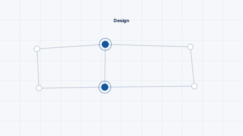
A token called blue-500 describes what it is. A token called surface-interactive describes what it is for. The second survives a rebrand; the first requires renaming everything.
Use a two-layer approach: primitives holding raw values, and semantic tokens referencing them. Components consume only semantic tokens, so changing a brand colour is one edit at the primitive layer.
Undefined categories get improvised, and improvisation is where inconsistency enters.
Keep tokens in one machine-readable file and generate the outputs each platform needs — CSS custom properties, platform constants, design tool variables.
Maintaining separate lists by hand guarantees divergence. Generation makes design and code agree by construction rather than by discipline.
With semantic tokens, dark mode and brand variants become alternative value sets rather than parallel stylesheets. High contrast modes and white-label deployments work the same way.
This is usually the point at which the effort pays for itself, and it is worth structuring for even if theming is not an immediate requirement.
Introducing tokens into a product with hard-coded values is a gradual process, and attempting it in one change is unwise.
Start by auditing what is actually used — the result is usually dozens of near-identical greys and a handful of arbitrary spacing values. Consolidate to a defensible set, then replace values component by component as each is touched.
Add linting that flags raw colour and spacing values in new code, so the problem stops growing while the migration proceeds. Without that, cleanup never overtakes accumulation.
Enough to cover real decisions and few enough to remember. A spacing scale of eight and a type scale of six is plenty for most products.
The W3C design tokens format is becoming the common ground and is supported by an increasing number of tools. Any documented JSON structure works if it is generated from.
Jointly. Designers own the semantics; engineers own the generation and platform outputs. Sole ownership on either side produces drift.
Keep reading
Five participants and an afternoon will tell you more about your product than a quarter of internal debate.
Software people use all day has different requirements from software people use occasionally. Optimising for the wrong one makes experts slower.
Most navigation reflects the organisation chart rather than user intent. Card sorting and tree testing fix that cheaply.