
Designing interfaces for complex operational workflows
Software people use all day has different requirements from software people use occasionally. Optimising for the wrong one makes experts slower.
ZooBieDoo Infotech Engineering TeamRead
Five participants and an afternoon will tell you more about your product than a quarter of internal debate.
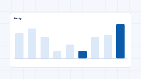
Testing with five to eight people per round surfaces the large majority of usability problems, and repeating in rounds finds more than one large study. The value comes from iterating, not from sample size.
This is a research result that consistently surprises teams who assume statistical significance is required. For finding problems, it is not; for measuring preferences, it is.
Do not ask whether the interface is clear — people are polite and are poor at predicting their own behaviour. Give them a realistic task and watch.
Perfect recruitment is expensive. People who resemble your users in relevant ways — domain familiarity, technical confidence — will find most interface problems.
Existing customers, people from another department, or a recruitment service for specialist audiences all work. Testing with your own team finds only the most obvious issues, because they know too much.
A research report nobody reads changes nothing. Write each finding as a specific problem with evidence and a suggested change, and put it in the backlog alongside other work.
Recording short clips of the moments where people struggled is the most persuasive artefact available. Watching a real person fail at a task ends debates that argument cannot.
The value of a session is lost if findings are not captured while fresh. Debrief immediately after each participant and note the three most significant observations before moving on.
Group observations across participants rather than reporting person by person. A problem two of five people hit is a pattern; a problem one person hit may be a pattern or may not, and the next round will tell you.
Distinguish observations from interpretations. “Three participants scrolled past the button” is an observation; “the button is not prominent enough” is one possible explanation among several.
Moderated for depth and for understanding why something happened. Unmoderated for reaching more people cheaply and for benchmarking specific tasks. Start moderated.
Every significant feature before build, and periodically on live journeys. A short round each sprint beats an annual study.
Test with people who share relevant characteristics. It is imperfect and dramatically better than internal opinion.
Keep reading
Software people use all day has different requirements from software people use occasionally. Optimising for the wrong one makes experts slower.
Tokens turn visual decisions into named values shared by design and code. Naming them well is the whole trick.
Most navigation reflects the organisation chart rather than user intent. Card sorting and tree testing fix that cheaply.